The Schedule is accessible by clicking on Planning button located in the main menu of Beeye (on the top left of the interface). The schedule allows:
- to view and plan the various tasks of your projects, whether for you or your team
- to identify scheduling conflicts that may occur when your resources are over capacity
In this article, you will learn how to:
- Navigate quickly
- Display resources
- Display availabilities
- Display schedule cards
- Customize schedule cards
- View the detail of the scheduled task
- Filter data
- Group data
- Sort data
- Manage views
- New aggregation mode
- Planning Header
Navigate quickly
The top of the interface features a timeline composed of different buttons and links to quickly display the desired period. You can switch from one view to another to navigate between strategic and operational.
 Legend:
- Quick links to go to the current year (Y), month (M), or week (W)
- Period selector to select a specific year, month, or week
- Navigation arrows to move to the next or previous periods
- Navigation buttons between year, month, and week views
Display resources

Under the quick navigation, there is the schedule made up of cards on the right representing the planned tasks and on the left, the column that displays the resources. In this column, you can immediately spot available or overloaded resources for the current period.

Displayed elements :
- Resource's name
- Resource's position
- Number of planned hours on the person: this figure varies depending on the selected period. Depending on the person's availability, the color varies:
- Gray: available
- Green: planned at 100%
- Red: overloaded
Display availabilities
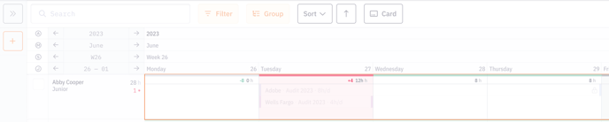
To the right of the column displaying resources, there are the schedule cards arranged in columns representing the days. Using a color code, you can quickly identify the available and overloaded days for your resources.

Different states:
- Availability indicator:
- Number in green if the resource is available (in the example above, the resource has 8h available)
- Number in red if the resource is overloaded
- No number if the resource is planned at 100% or not available
- Planned time indicator
Colors reinforce the indicators:
- White: available
- Green: planned at 100%
- Red: overloaded
- Gray: not available (on leave, for example)
Display schedule cards
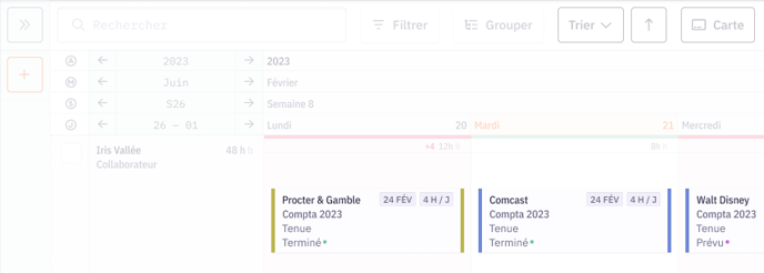
The cards summarize all the necessary information to understand the work that needs to be done.
Displayed horizontally or vertically, they indicate the following information:
- The client's name
- The name of the project this task is attached to
- The task's name
- The task's status
- The lock showing the card's locking (a locked card cannot be moved if one does not have the necessary access rights)
- The task's due date
- The number of planned hours
- A customizable color code (to indicate the workplace, for example)
- The due date of an overdue task (indicated in red)
Customize schedule cards

Each resource can choose to display the most relevant information they need for their use. Just click on the "card" button located under the quick navigation.
Learn more
Discover how to customize the display of schedule cards in this article.
View more detail about the scheduled task
It's possible to get more information on a scheduled task. Just click on a card to bring up a side panel on the right.

Voici les informations affichées :
- The name of the scheduled task
- The resources planned on this task (with the option to add resources, modify the scheduling, and launch automated scheduling)
- The name of the project the task depends on (with a quick link to open the project form)
- The client's name
- The task's manager
- A comments section
Filter data

You can refine your list of resources using filters on all criteria relevant to you.
To do this, click on the Filter button to display the right side panel:

- Add a filter
- Active filters
Group data
The “group” button allows aggregating information to get a more global analysis of your teams or your projects. For example, it's possible to display the total planned time of the team over a period (week, day, etc).

Above, example of grouping by projects:
- Total planned time of the project over the period
- Number of days the team is overloaded over the period
- Total planned time of the team per day
- Number of people from the project overloaded on the day
Sort data
Quickly identify your most available or overloaded resources to resolve conflicts. You can choose to sort your resources by availability or by name.

Manage views
You can save and share your schedule views with your teams.

- Create a new view
- My list of views
- Choose my home view
- Rename, duplicate, share, delete a view
- Display / hide a view
- Manage all my views
Learn more
Discover how to define and use views in Beeye in this article.
New Aggregation Modes
The Planning page now offers three new aggregation modes to view scheduled time at different levels of detail:
-
Narrow (Day): detailed view of scheduled hours per day.
-
Narrow (Week): total scheduled hours per week, highlighting overloaded weeks.
-
Narrow (Month): monthly summary of scheduled hours per collaborator.

Planning Header
The planning header displays key information for each collaborator and lets you choose the most relevant indicators.
1. Collaborator Information (up to 5):
Name, Team, Role, Sales Price, Cost Price, Position
2. Planning Indicators (up to 5):
Planned Hours, Availability, Conflicts, Planned Utilization %, Total Work Time

Tip: Select only the most important elements to keep the header clear and easy to read.